

Brand Strategy | Rebranding | Visual Identity | Product Positioning | Ecommerce
Pyrz Art Studio began in 2020 as a small handmade business built around a name that was deeply personal to me.
“Pyrz” is my family name, and I associated it with heritage, resilience, and hard work. At the time, using it for the business felt like a natural way to connect what I was creating with something meaningful.
But as the business evolved, I began to recognize a problem.
What carried meaning for me was not necessarily easy for a customer to pronounce, spell, remember, or search for later.
By 2025, the business itself had also changed significantly from what I started during the pandemic. I was no longer primarily selling cotton face masks locally. I had opened an Etsy shop, expanded into a wider range of practical fabric products, improved the way those products were photographed and presented, and begun selling through in-person events.
The brand had grown beyond the identity I originally created for it.
That led to the transition from Pyrz Art Studio to Wild Raven Co.
The Challenge
The original brand had two main limitations.
The first was practical.
Pyrz was meaningful, but it created friction.
Customers unfamiliar with the name could struggle to pronounce it, spell it, or remember it later. That became increasingly important as the business expanded beyond local custom orders and into Etsy and in-person events.
A customer who encounters a business at an event may only have a few seconds to register the name. If they cannot easily remember or search for it afterward, the brand has created an unnecessary barrier.
The second challenge was that Pyrz Art Studio no longer accurately represented what the business was becoming.
The product line was changing, the visual presentation was becoming more intentional, and I wanted an identity with enough flexibility to grow into new product categories over time.
The business needed a name and visual system that could evolve with it.
Finding a Name That Could Grow With the Business
When I started exploring the rebrand, I wanted the new identity to retain a connection to where the Etsy side of the business had developed: California.
Living in the Antelope Valley gave me several directions to explore. I considered names inspired by local natural elements, including California poppies and Joshua trees. One of the stronger alternatives was The Orange Poppy.
Ultimately, Wild Raven Co. represented more of what I wanted the business itself to stand for.
Ravens are associated with problem solving, planning, communication, adaptability and playfulness. They are also frequently connected with ideas such as wisdom, transformation, rebirth and creation.
Those characteristics aligned closely with the type of brand I wanted to build:
creative, resourceful, adaptable, useful and continuously evolving.
The raven also felt particularly fitting for a business going through a transformation of its own.
The rebrand was not about abandoning the meaning behind Pyrz Art Studio.
It was about translating those values into an identity that was easier for customers to understand, remember and connect with.
Rebuilding the Visual Identity
The transition extended beyond the business name.
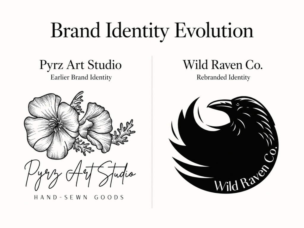
Pyrz Art Studio used a softer visual palette built around blush tones, golds and similar colors. Over time, I realized that aesthetic did not feel particularly representative of me or of the direction I wanted the business to take.
Wild Raven Co. shifted into a richer, jewel-toned palette built around:
Viridian green
Dark royal purple
Deep teal
The new palette felt more distinctive and better aligned with the personality I wanted the brand to have.
The logo also changed substantially.
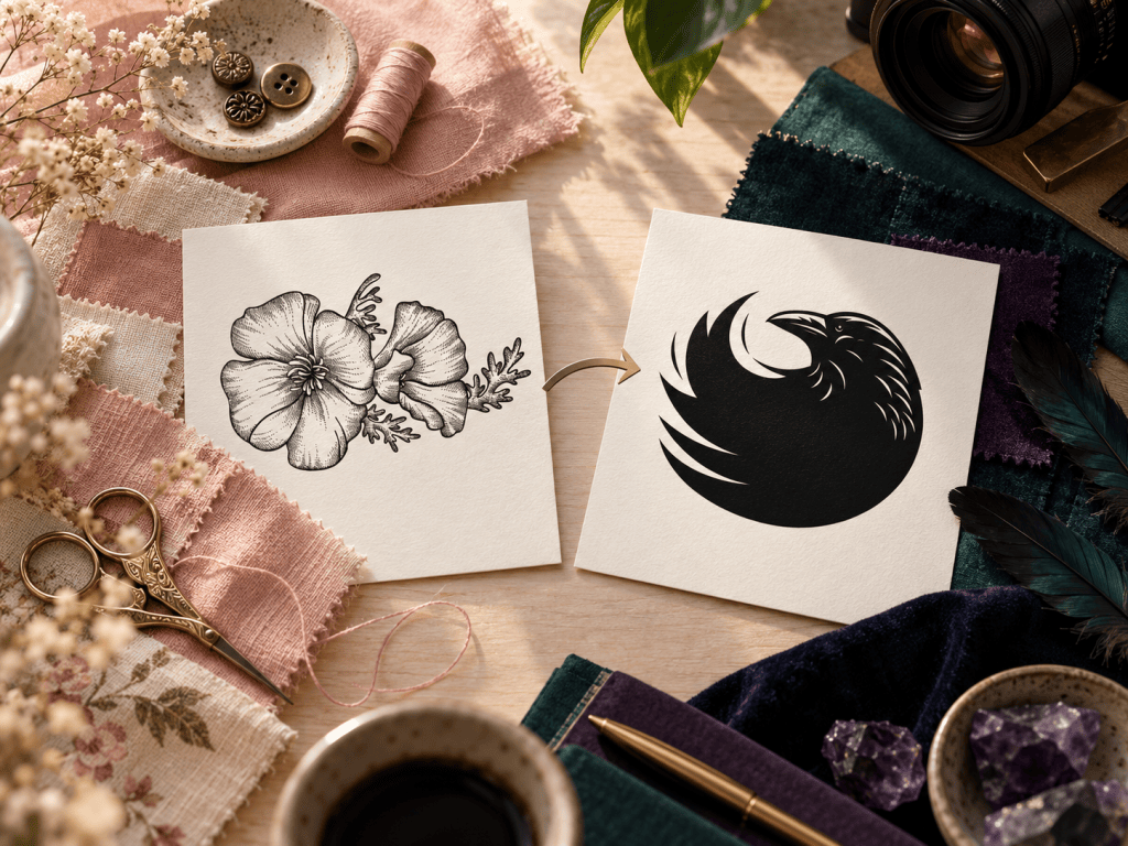
The Pyrz Art Studio identity evolved over time, but the version I retained centered on illustrated poppies paired with the Pyrz Art Studio name and the descriptor “Hand-Sewn Goods.”
For Wild Raven Co., I moved toward a more simplified circular mark featuring a raven with the company name integrated into the shape itself.
The shift from a more delicate floral identity to a stronger, more graphic raven mark helped create a brand that felt more memorable, more cohesive, and better suited to the direction I wanted the business to grow.
The goal was to create an identity that felt cohesive, recognizable and flexible enough to support the brand as the product line continued to grow.
Improving the Product Presentation
The rebrand also coincided with a significant improvement in product photography.
Earlier product images were primarily taken with my phone using available lighting and relatively simple setups.
As the Etsy shop developed, I moved toward a more intentional photography process using a Canon Rebel T7, dedicated light sources and controlled backgrounds.
That changed photography from simply documenting a product into part of the brand experience.
For an ecommerce business, customers cannot physically examine the item before purchasing it. Product photography therefore has to help communicate details such as:
texture, construction, scale, color and overall quality.
Improving the photography allowed the online presentation to better reflect the care being put into the products themselves.
Designing Around Everyday Problems
As the business evolved, I began to recognize a common thread connecting many of the products I was creating.
They often started with a small frustration from everyday life.
I began making scrunchies after becoming frustrated with traditional hair ties causing headaches and with the quality of many mass-produced alternatives.
I expanded into over-the-collar dog bandanas, offering a practical way to add personality without relying on a traditional tied bandana.
I added wristlets because I was constantly misplacing my own keys.
And I began creating fabric book covers because I wanted the ability to read in public without necessarily turning the title of the book into part of the conversation.
The products were different, but the underlying idea was similar:
whimsy with functionality.
That helped clarify who Wild Raven Co. was for.
The audience I envision includes people like me, as well as the partners shopping for them: people who are tired of disposable-feeling or low-quality products and want everyday items that are useful, well made and a little more personal.
Building a Lower-Waste Mindset Into the Brand
Resourcefulness is another part of the Wild Raven identity I wanted to carry into the way products are made.
Fabric-based production inevitably creates remnants, but I try to view leftover material as potential material rather than automatic waste.
Careful measuring helps reduce unnecessary cutting, while usable scraps are saved when I know they can serve another purpose.
Very small pieces may be retained for stuffing or personal projects, while larger remnants can become prototypes or entirely different products.
One example was using leftover material to create a mat for my KitchenAid mixer, which also became an opportunity to think about whether kitchen products might eventually make sense for the brand.
That mindset extends beyond materials purchased specifically for the business. Even durable items such as denim from clothing that no longer fits can potentially become raw material for something new rather than being immediately discarded.
I do not position Wild Raven Co. as a zero-waste brand.
Instead, I treat lower-waste production as an ongoing design principle:
use what can be used, design intentionally, and continue finding value in materials that still have life left in them.
What the Business Data Showed
The rebrand was not followed by a dramatic increase in order volume, and I think that context is important.
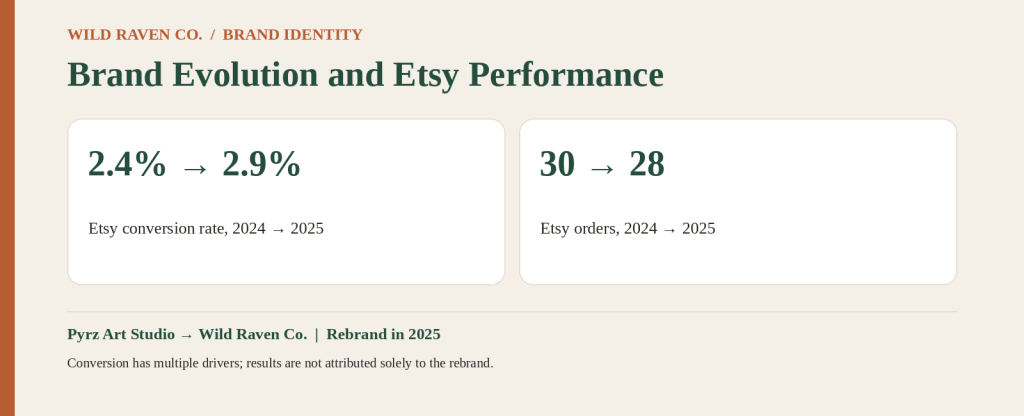
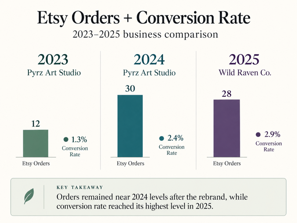
In 2023, while operating as Pyrz Art Studio, the Etsy shop generated 12 orders with a 1.3% conversion rate.
In 2024, Etsy orders increased to 30, with conversion improving to 2.4%. The business also generated additional sales through in-person events that year.
In 2025, after transitioning to Wild Raven Co., Etsy recorded 28 orders with a 2.9% conversion rate.
The rebrand did not create an overnight surge in sales, and I would not attribute the increase in conversion solely to the new identity.
Product mix, traffic quality, photography, pricing and customer intent can all influence ecommerce conversion.
What the data does show is that the business maintained a similar level of Etsy order volume from 2024 to 2025 while reaching its highest conversion rate of the three-year period.
For me, that makes the rebrand less about claiming a dramatic performance win and more about creating a stronger foundation for the business to continue evolving.
What the Rebrand Accomplished
The value of the transition was broader than a change in sales.
The rebrand addressed several structural problems at once.
Pyrz Art Studio was personal, but difficult for unfamiliar customers to pronounce and remember.
Wild Raven Co. gave the business:
- A more memorable and accessible name
- A visual identity that better reflected the brand’s personality
- A broader foundation for future product categories
- A clearer connection between product utility and brand storytelling
- A more defined target customer
- A stronger framework for lower-waste design decisions
- More room for the business to evolve without outgrowing its name
Most importantly, the new identity feels capable of growing alongside the business rather than defining what the business is allowed to become.
Strategic Takeaway
Rebranding Wild Raven Co. taught me that a brand can be personally meaningful and still create unnecessary friction for the customer.
The original Pyrz Art Studio identity represented where the business came from.
The challenge was determining whether it could also support where the business was going.
That required me to evaluate the name, visual identity, product presentation and customer experience from outside my own perspective.
Could someone remember the name?
Could they find the business again?
Did the visual identity feel connected to the products?
Did the brand have enough flexibility to grow?
Wild Raven Co. allowed me to preserve the values behind the original business—hard work, creativity and resilience—while expressing them through an identity that is easier to understand, more distinctive, and better suited to future growth.
A rebrand should not erase where a business came from. It should make where it is going easier to see.

